
![Relatable logo [R]](https://cdn.prod.website-files.com/65cf396e067c590ca7104a0d/65cf396e067c590ca7104a4d_Relatable_Favicon.png)

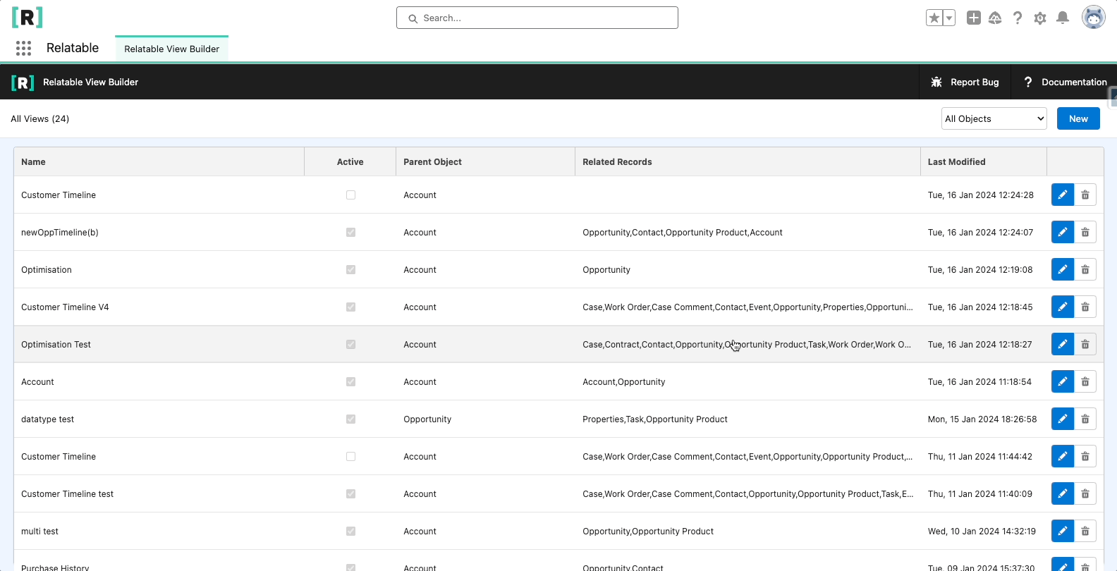
Create A New View
From the View Builder page, click new to launch the View properties panel. From here you can edit all of the View’s properties. Once the required properties are populated (see below), click save to create a new View. You will be redirected to the View. You can re-open the properties panel by clicking the pencil icon next to the View’s name.
View Type
With Relatable, you can create different types of views to display and interact with your Salesforce data.
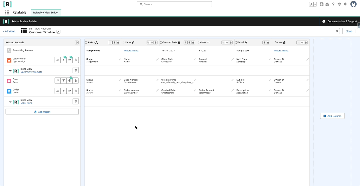
List Views / Report
To create a Record List, leave the Parent Object dropdown blank when setting up your view. You can add any* combination of objects to the list, regardless of their relationships.
By default, all records from selected objects are included, but you can apply filters to refine your list—just like you would in a standard Salesforce List View or Report.
📌 Where to use it: A List View can be placed on any Lightning App Page or Record Page.
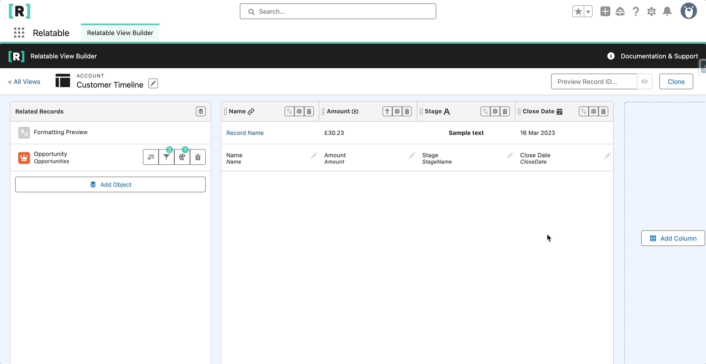
Related List
To create a Related List, select a Parent Object to display its related records. The available objects in your view will be limited to those that have a defined relationship with the selected parent.
📌 Where to use it: A Related List can only be viewed on the Record Page of its Parent Object.
View Properties
- View Name: Required property. This is the name users see. View Name can be edited after a View is created
- Parent Object: Optional property. Select a parent object to build a related list, leave blank to build a List View / Report. The parent object dictates the list of related objects that are available in the View. e.g if you select the Account object, only objects that have a lookup relationship to Account are available. You can select from standard or custom objects. Each View can use a different parent, you can create multiple Views using the same parent. Note: The parent object cannot be changed once a View has been created
- Active: Optional checkbox. When active, a View becomes available to users in the lightning component. The component only shows active Views where the parent object matches that of the lightning record page. I.e an Account lightning page with the component placed on it, will only show Views where the parent object is Account. You can toggle the active status at any time
- Allow Inline Editing: Optional checkbox. When active, enables users to perform inline editing for that View, disabled when inactive. Editing is subject to Salesforce permissions
- Show New Record Button: Optional checkbox. When active, enables users to create new records from the View, disabled when inactive. Creating new records is subject to Salesforce permissions
- Show Attachments: Optional checkbox. When active, enables users to see and upload attachments to rows, disabled when inactive. Viewing and creating attachments is subject to Salesforce permissions
- Show Record Actions: Optional checkbox, When active, enables users to see edit and delete actions per row, disabled when inactive. Editing and deleting is subject to Salesforce permissions
- Allow CSV Export: Optional checkbox. When active, enables users to export the current rows as a CSV file. Export is subject to Salesforce permissions
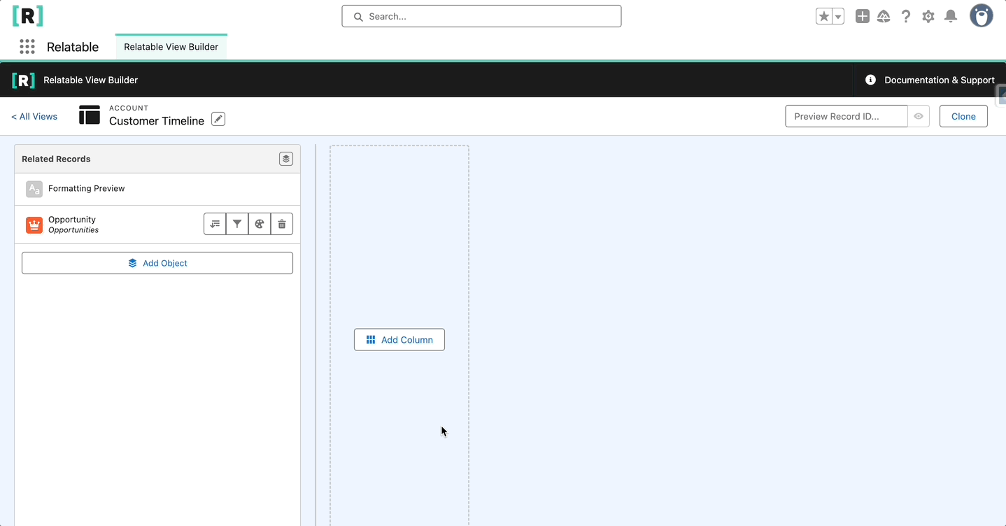
Add Objects as Rows
To add objects to your view, click "Add Object" to open a dropdown of available objects.
- If no Parent Object is selected, the dropdown will display all available* objects in your org.
- If a Parent Object is specified, the dropdown will be limited to objects that have a lookup or master-detail relationship with the parent.
Example:
If your view has Account as the Parent Object, you can add Opportunities. This means that for each Account, you’ll see all related Opportunities displayed as rows in the view. if you create a view with no parent object and add Opportunities, all Opportunities will be visible.
Understanding the Dropdown List
The dropdown displays:
- The Object Name
- The Relationship Name between the object and the parent
If the same object appears multiple times, it’s because your org has multiple relationships between those objects.
* certain objects will not be visible i.e history tracking

Add Child Records with Inline Views
Relatable allows you to expand rows and view related child records using Inline Views. Here's how to set them up:
Step 1: Create an Inline View
- Create a new view.
- In the Parent Object dropdown, select the object you previously added to your main view.
- Add the related objects you want to display as child records.
- Configure your columns and rules as needed.
Step 2: Link the Inline View to Your Main View
- Return to your original view.
- Click the Inline View icon next to the object you want to expand.
- Select the newly created Inline View to link them together.
Additional Features
✅ You can add multiple Inline Views to the same view.
✅ Inline Views can have their own inline views. Chaining these together allows you to drill as deep into your data model as required.
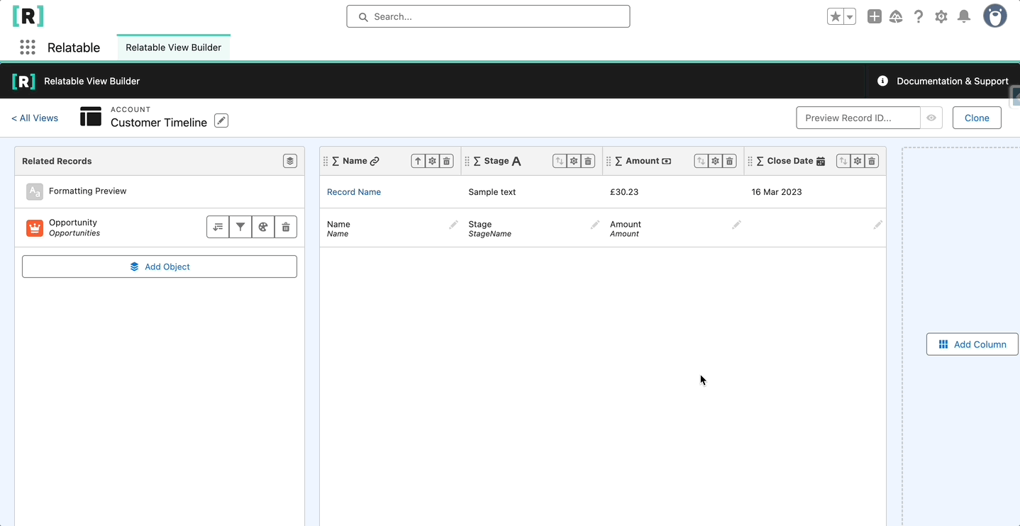
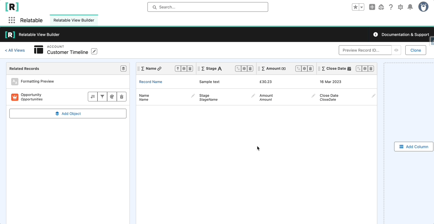
Add Columns
Click the Add Column button to open the column configuration panel.
Column Properties:
Column Label
Required property. This is the name users see. Column labels can be edited after a View is created.
Data Type
Required dropdown. Controls field mapping and formatting options. E.g if you select the Checkbox data type for your column, only fields where the data type is checkbox will be available in the mapping dropdown. A breakdown of each data type below:
- Object Name - Relatable includes object icons by default, however sometimes it might not be clear what object the icon represents. This data type returns the selected object's name. No manual field mapping is required.
- Record Name - For showing a records name/number as a hyperlink. Users can navigate to the record by clicking on the link
- Text - For showing any standard text, long area, picklist or multi-select picklist fields Note: We do not currently support rich text fields
- Number - For showing any number or currency fields, any iso code or currency symbol is removed. Select number of decimal places to show
- Currency - For showing any currency fields, includes iso code or currency symbol. Select number of decimal places to show
- Date - For showing any date or date/time fields in a date format
- Time - For showing any time fields in a time format
- DateTime - For showing DateTime fields in a date time format. Select date and time formatting
- Percent - For showing any percentage fields. Select decimal places to show
- Checkbox - For showing any checkbox fields
- Lookup - For showing a related records name/number i.e Owner name
Note: Once a column has been created, the data type cannot be changed. If you would like to explore this concept further, Our Use Cases provide step by step guides to creating a View from scratch focused on a specific scenario.
Field Mapping
Once you have a minimum of one object and one data column defined, you can start mapping object fields to data columns. Click in the cell to open the dropdown and select a field from the list available. Available fields are defined by the data type of the column selected. If you do not see a field in the list, it’s likely as a result of data type incompatibility. Eg. We currently do not let you map a currency field to a checkbox column, this is to allow your rows to be sorted by column.
Add Text Styling
You can apply text formatting and text alignment to each column. Click settings in a column header to open the properties panel. Click the Text Style tab and select your preferences.
Group Column
Group your rows together using one of your data columns. Click the ⚙️ icon in a column header and select Group Rows By This Column. Unselect to remove the grouping. Only one column can be grouped. Grouping by a new column will ungroup any previously selected grouped columns. Any number or currency columns with the Show Totals box ticked, will show a subtotal per grouping.
Please note Salesforce does not support grouping by certain data types. e.g auto num / multi-select picklists. This link provides an overview of these limitations.
Object Filters
Add filters to your object rows to only show records that match certain criteria. Click the filter icon against an object, on the Filters tab select a field, the operator and enter the filter value. Click Add Filter to add an additional filter, click the bin icon to remove. You can add up to 10 filters per row object. Note: AND logic is applied when applying more than one filter criteria.

Conditional Formatting Rules
There are two ways to apply Conditional Formatting rules, either at row or column level. Row level lets you set object specific rules, and highlights an entire row, column level is a cross object rule that highlights cells in a specific column. Note: Column rules override row rules.
Add Row Conditional Formatting Rule
Click the ⚙️ icon next to an object to open the object settings panel. Click the Conditional Formatting tab. Select a field from the dropdown, select an operator and enter the criteria. Apply the rule to either the cell background or the text and select a colour. Click Add Condition to add an additional rule, click the bin icon to remove. You can add up to 10 rules per row object.

Add Column Conditional Formatting Rule
Click the ⚙️ icon in a column header. Click the Conditional Formatting tab. Unlike the row level rule, column rules evaluate based on each object's field mapping. Select the operator and enter the criteria. Apply the rule to either the cell background or the text and select a colour. Click Add Condition to add an additional rule, click the bin icon to remove.

Column Ordering
Drag and drop columns to reorder them, the column position controls the order they appear when viewing on a lightning record page.

Set Default Sorted By Column
Click the sort icon to set a column as the default. When the Relatable component is first loaded or refreshed, the View will sort by the selected column. If a text column has any multi select or long area fields mapped to it, it cannot be sorted and you will not see the icon. You can choose to sort ascending or descending, click the sort icon again to change your preference. If no column is selected, the first available column will be selected as the default.

Preview Mode
You can test out your View before activating it using the Preview function. Find a record you want to preview. Paste the Salesforce Id of that record into the preview box and click the eye icon to preview. Note: the Id must be of the same type as the parent object of the View. Certain features are disabled in preview mode.
Clone View
Click the Clone button to create a copy of one of your Views.

