
![Relatable logo [R]](https://cdn.prod.website-files.com/65cf396e067c590ca7104a0d/65cf396e067c590ca7104a4d_Relatable_Favicon.png)

We are going to build our timeline with some commonly used Sales Cloud objects. If you use Sales Cloud, it’s likely you’ve interacted with most of these at some point. No two businesses are the same though, so the use of these will probably be a little different, and you might have some custom fields or objects to throw into the mix. We’ve designed the View Builder so you can build with your own data model in mind. Use this scenario as a base, and tweak to suit your specific needs, or just use it to see what’s possible. We love code, which is why we’ve written it all for you, the View Builder is 100% point and click.
Create a new View
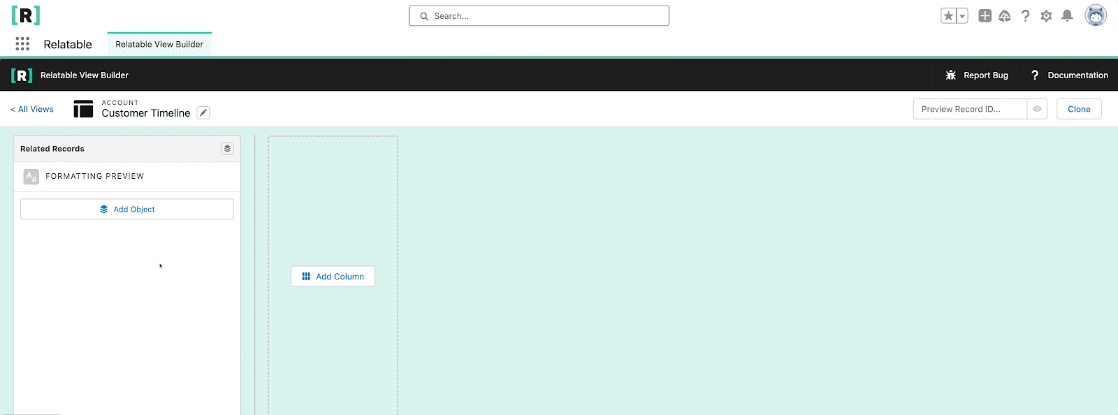
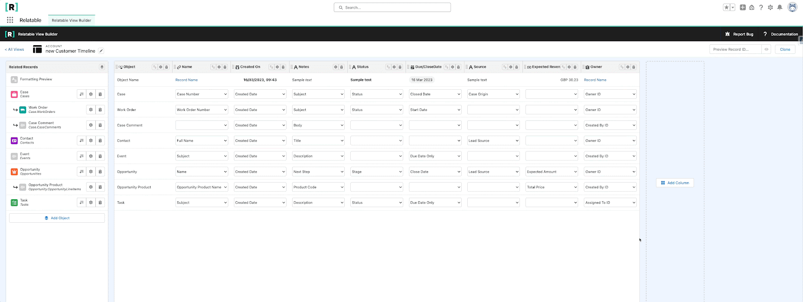
Start by navigating to the Relatable app and go to the View Builder tab. Click the new button to create a new View, let's call it “Customer Timeline”. This is the name users will see. We can always edit the name at a later point. The critical part for now is picking the parent object, this controls the related records we have to play around with. For our timeline View, we are going to use “Account”.
Note: we can’t change the parent object once the View has been created.
Let's leave the View inactive until we are ready to release it to users. We can leave the other options ticked for now though. These options allow you to control certain features of the application. These can be changed at a later date too. Click save.
Add Objects
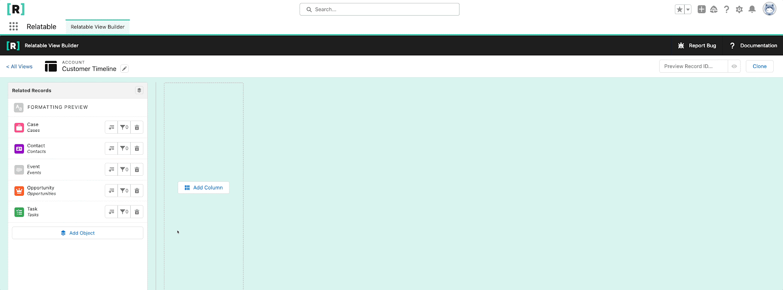
Next, let’s add the objects we want to appear as rows in our View. Because we selected Account as our parent object, the dropdown list shows all the objects that look up to Account. If you have your own custom objects or relationships, you should see them in the list too. We show the object label and the relationship name, so if you have two lookups using the same object, you can differentiate between them.
For our Timeline scenario let’s add the following as row objects:
- Case
- Contact
- Event
- Opportunity
- Task
Note: The order you add objects to the View doesn’t matter. Rows are displayed based on column sorting, which we will cover later
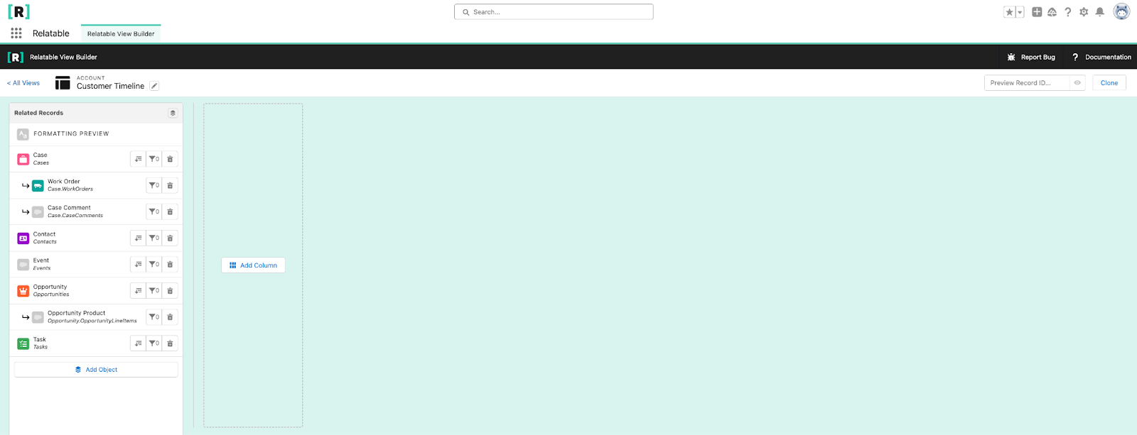
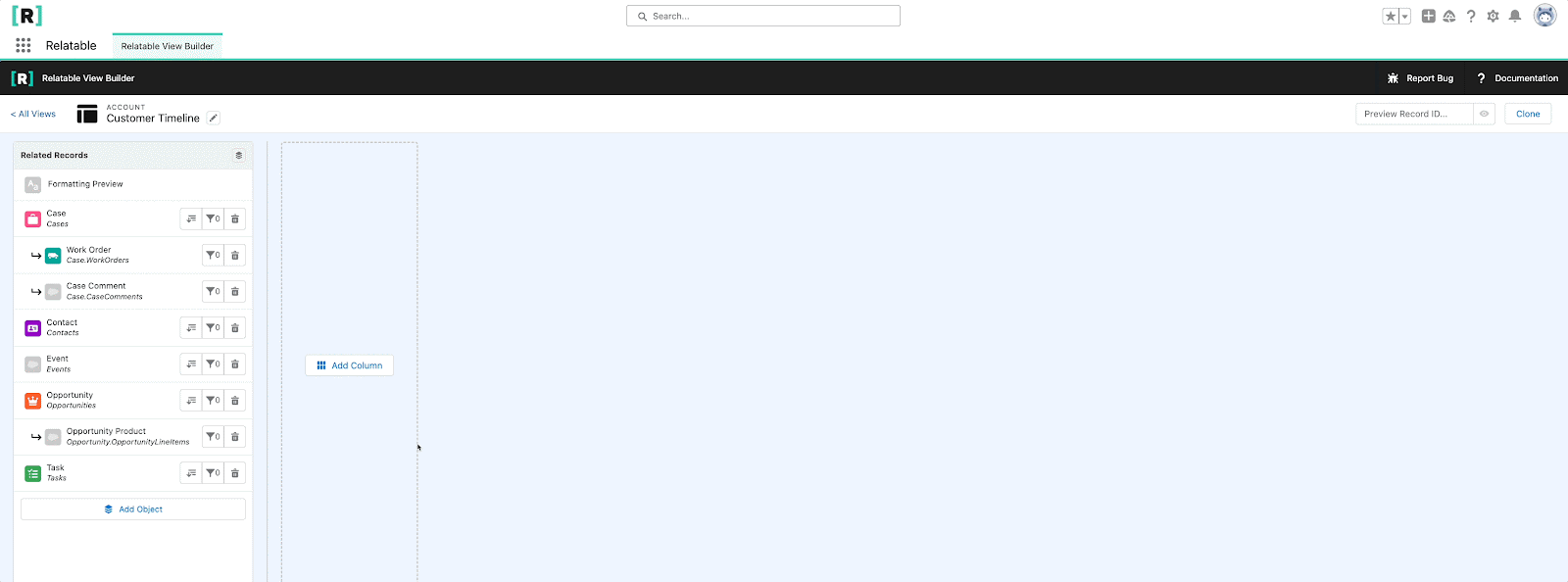
Now, let’s add some more, but this time as child rows of one of the objects above. Adding child rows lets you view child records for a specific row, these records are sorted within the context of the parent row. Next to Opportunity, select the add child row icon to see a list of Opportunity child objects. Add the following:
- For Opportunity:
- Opportunity Products
- For Case:
- Case Comments
- Work Orders
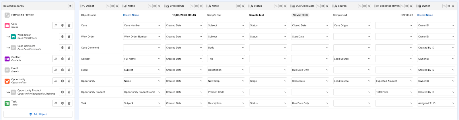
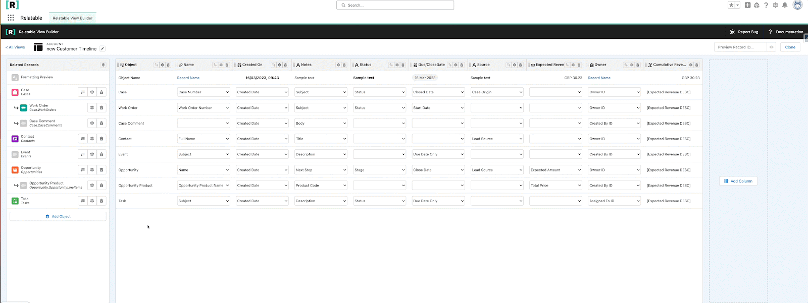
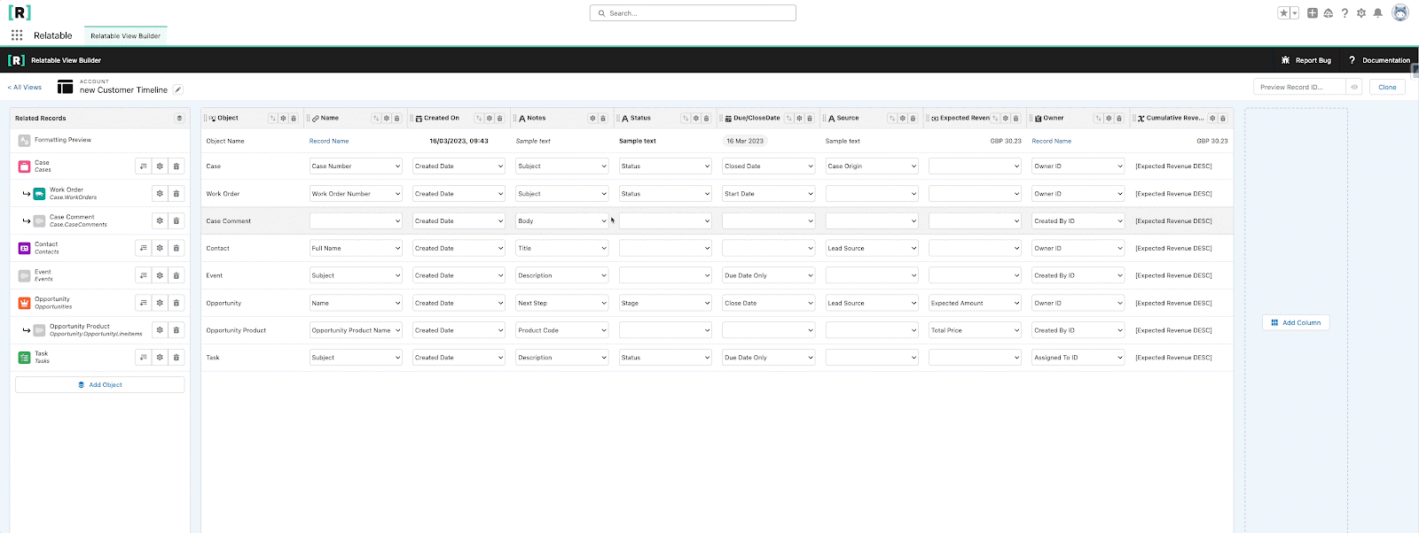
Once you’ve done both steps, your View should look something like the below. Make sure you save your View so you don’t lose any progress. You can remove rows by clicking the 🗑️ icon to delete that object from your View.
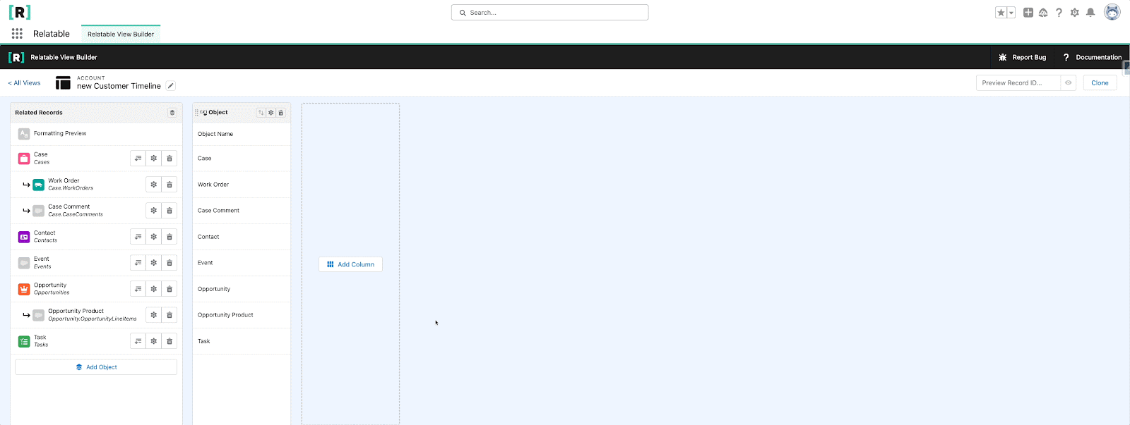
Add Columns & Formatting
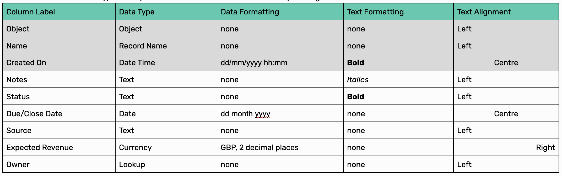
Time to add some columns. A View’s columns are a bit like selecting fields to display for a standard related list, except we can map fields from multiple objects. Click Add Column, give your column the name “Object” (you can change the name later on) and select ‘Object Name’ from the data type drop down. Click Add. By default, Relatable displays the object icon for each row, but sometimes it's not obvious what the icon represents, so we’ve included this data type to map the object name. You don’t have to do any field mapping for this one. Like so:
The data type you select is important as it controls what fields are available. We can only map fields to a column with compatible data types. So if you pick Date as your data type, you’ll see date & datetime fields only. We can’t combine dates with booleans for example, otherwise sorting would be impossible.
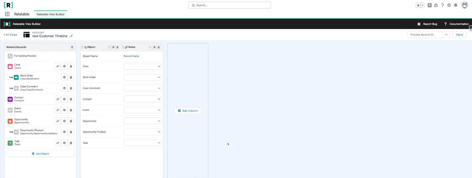
Now, let’s add another column. This time to display a row's name. Call it ‘Name’ and select the Record Name data type, this makes the cell a hyperlink, so users can navigate to the record if they want to see more details.
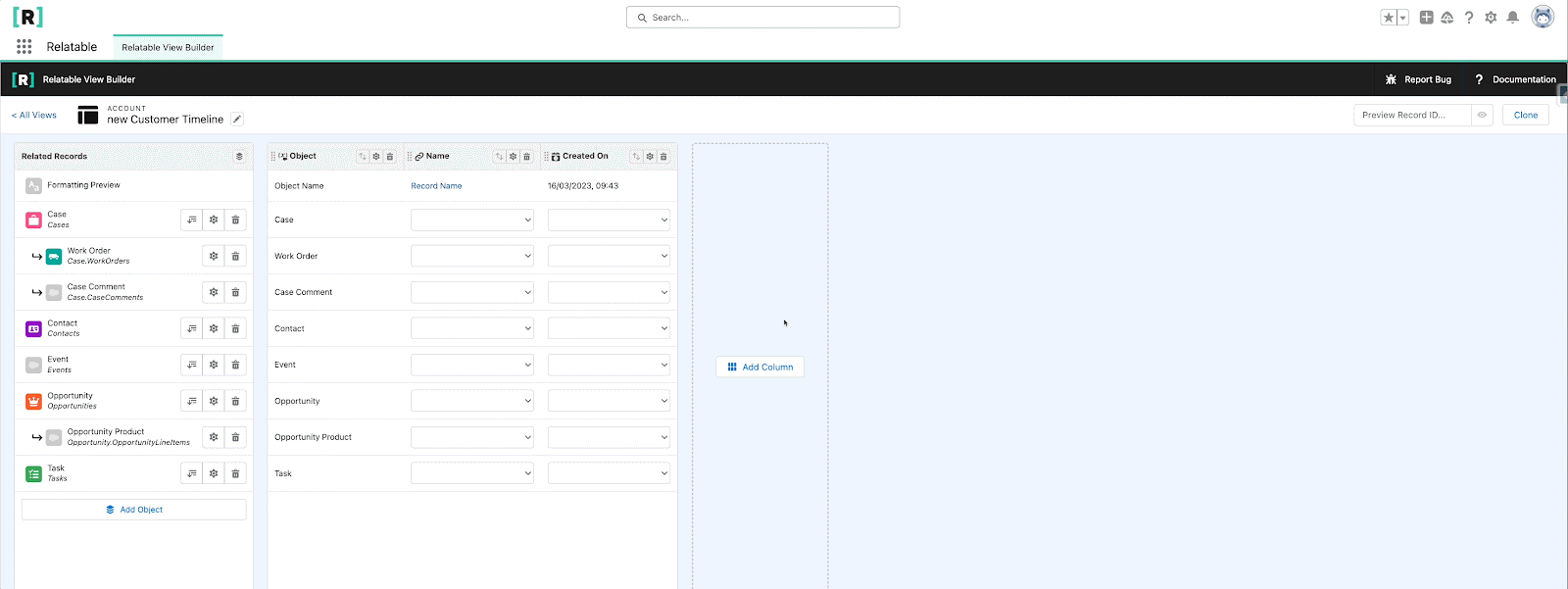
Let’s add another column to show the created date of each row. Create a new column, give it the name ‘Created On’ and select Date Time from the data type dropdown. You will notice for this data type, we have some formatting options, this lets you modify how your data is displayed. For this column, let’s select dd/mm/yyyy as our date format and hh/mm as our time.
To make some of our data stand out, we can apply text styling to each column. Click the cog icon to edit the Created On column, click the text style tab to select text formatting and alignment preferences. Let's make this column bold and centre aligned.
For more detail about each data type and formatting options, see our setup guide here.
Now we have a few columns built, try adding the rest from the table below. You can create columns in any order you want, you can drag and drop columns to re-order them. The order they are in controls how they are displayed.
Note: you can’t change a column's data type once it's created, so make sure you select the correct type when you create it. You can remove a column by clicking the 🗑️ icon.
Map Fields To Columns
Now we have all our columns, let’s start mapping fields. (you don’t have to create all the columns first, you can map as you go, your call). As mentioned above, the fields in a cell's dropdown are dependent on the data type of that column. The table below shows the field mapping for each of our columns. If you don't see the field you want to map, it most likely has a different data type to the column. You don’t need to map a field to every cell, so you can leave them blank if there's nothing to map.
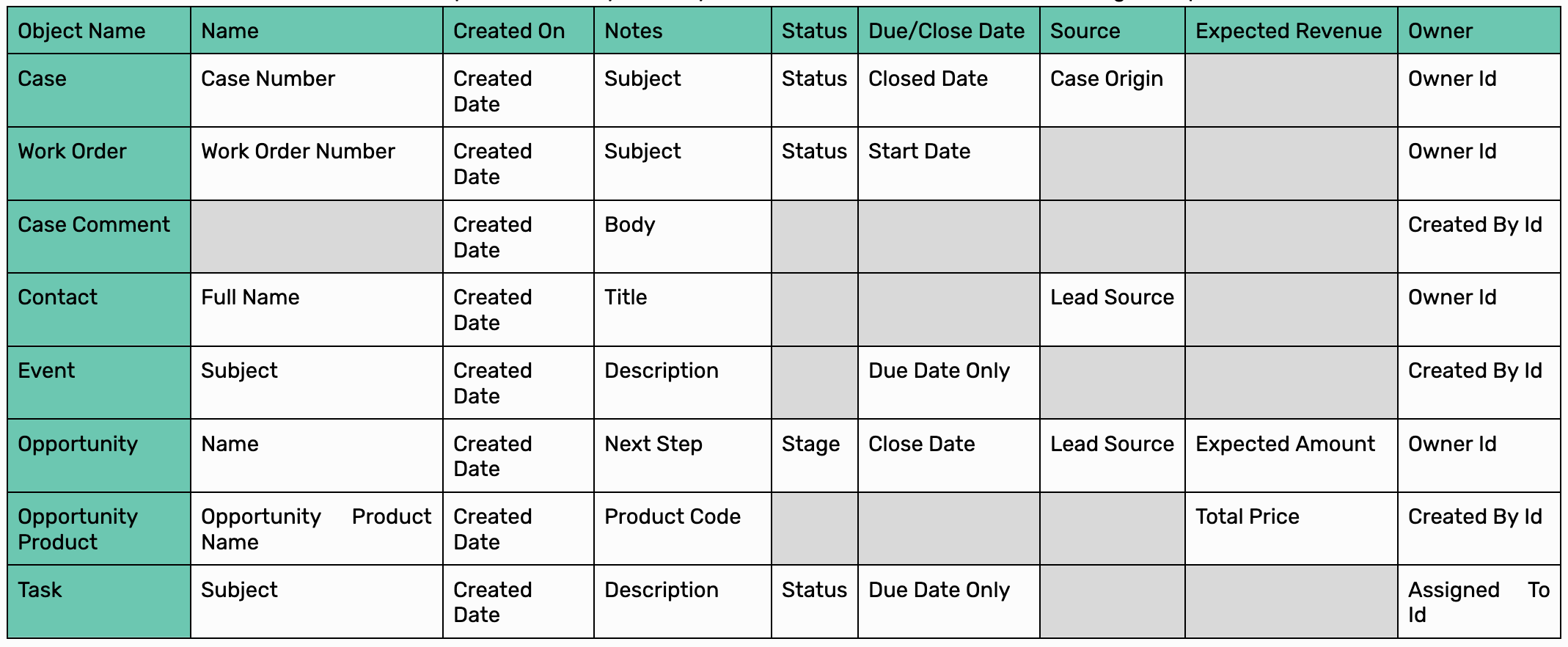
Your View should look like the below once you are done.
Add Formula Column
Before we move on, we need to add one more column. Formulas work a bit differently to the ones above, instead of mapping a field to each cell, we select one of our existing columns to reference. The system will calculate the cumulative total of your records based on how they are sorted. In our case, this will let us see how much revenue we have made from a customer over time, without building rollup summaries or complex automation. Click Add Column, and call it ‘Cumulative Revenue’, select the ‘formula’ data type, select ‘Rolling Total’ as the formula type, then from the Column dropdown, select ‘Expected Revenue’. Finally make the direction ‘Descending’.
Note, this column only lives in relatable, so you can’t report on it, but it is included when you export a view into a csv file.
Add Row Filters
Against each object row, you’ll see the ⚙️ icon, this contains a tab for adding object filters. As an example, if you only wanted to see opportunities of a certain stage, or where a close date is in the future. Users will only see records that meet your filter criteria. Rules are object specific, and you can add more than one rule per object (up to 10). Users can apply their own filters when they view the component, but can’t remove any filters added in the View Builder. We don't have any filters to apply for this scenario, but feel free to add some of your own.
Note: filter rules use AND clauses only, being able to set your own clauses is on our roadmap.

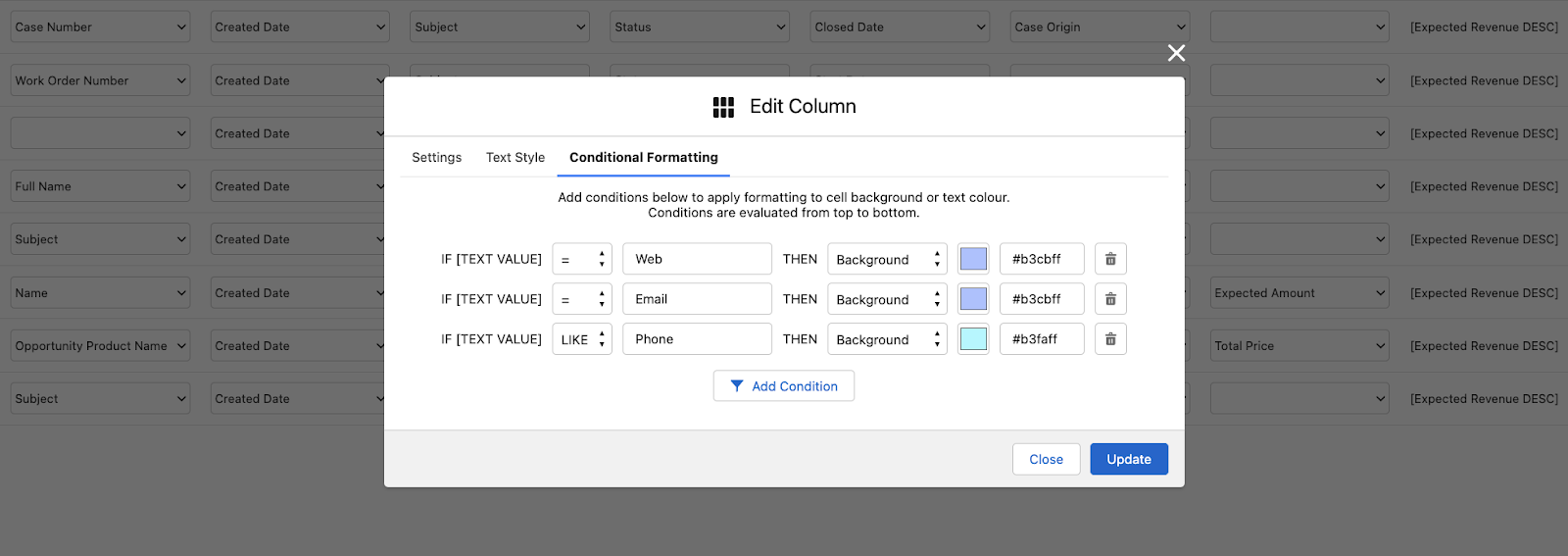
Add Conditional Formatting
There are two ways to apply Conditional Formatting rules, either at row or column level. Row level lets you set object specific rules, and highlights an entire row, whereas column level is a cross object rule that highlights specific cells in that column. Let's add some of each type to our View:
Note: Column rules override row rules
First the row level rule. Click the ⚙️ icon next to Opportunity and go to the conditional formatting tab. We want a rule that clearly shows us if an Opportunity is Closed Won. Select “Won” from the dropdown, select the equals (=) operator and “True” as our condition. Then pick a background colour, we’ve picked green, but feel free to pick something else. You can add multiple row level rules, so let's add a second rule that makes the row red if the Opportunity is “Closed Lost”. These rules will only apply to Opportunities.
Note: the system evaluates rules top to bottom, so if your row matches more than one rule, the latest one it matches will win
Now, some column level rules. Click the ⚙️ icon in the column header, and go to the Conditional Formatting tab. Unlike the row level rule, the field the rule evaluates on is based on the field mapping in the cell, so all you need to do is define the operator and the value to match on. Each column can have up to 10 conditional formatting rules, and we can add rules to as many columns as needed. We are going to add rules to two of the columns, firstly, we want to highlight if a cell in the Notes column is empty, so users know they need to provide an update to this record.
Next, we want to colour code our Source column so similar types are grouped together. Like so:
Set Default Sorted By Column
Use the arrow icon to set a column as the default. In this case, we want to sort by the Created On column in descending order, so our users can see when records were created chronologically. The default is just that, the default, and will be how records are ordered when users first load the View. Users can change to sort by any other available column and change to ascending or descending order. If there is no default selected in the View, the component sorts by the first column it can find.
Note: any column with a long or rich text field is not sortable. You won’t see the icon for these columns.

